Features released today on the Web ski patrol dispatch and reporting system, and its a major one:
Charts! Slice and dice your data any way you like.
You can now build the following charts:
- Timelines (and compare to a previous timeframe)
- Bar Charts (like Timelines, but different)
- Pie Charts (see the breakdown on any data point)
Access Charts as a dispatcher or Manager via the Menu > Charts.
Adding to the Reporting capabilities, you can now select any data point in the incident configuration, and report on it with a date range. With Timeline & Bar charts, you can even select two different metrics and compare them across two different timeframes.
Here are a few examples:
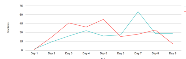
Timeline Chart, comparing two date ranges, with the same data point
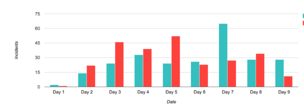
Bar chart, comparing two date ranges, with the same data point
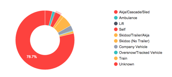
Pie chart showing the breakdown of one data point
And here are a couple of other things we fixed:
- Patroller / user lists are now all alphabetical
- Binding DIN sizes can now be decimals
0 Comments
Leave A Comment