As a manager or dispatcher in Medic52 Dispatch you can generate charts on your data. Any data point that has been entered into the system can be used to report and chart upon. Here are a few ideas:
- Age spread of patients
- Participant activity
- Injuries sustained
- Beginners on intermediate or advanced runs
- Lift related incidents, with beginners
- Total incidents of staff members
Chart Types
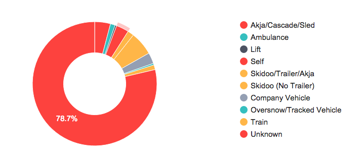
Pie chart of patient transport methods used
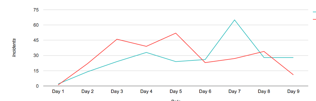
Timeline of Total incidents in a period, compared with the same period at a previous time
Comparing this week to last week
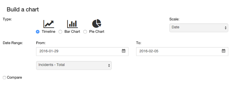
You are also able to compare a date range with another of the same size. For example you may want to look at the total number of incidents this winter against last winter. This can be achieved with these steps:
- Enter the date range for your current season
- Select the Incidents – Total item from the range of data points
- Check the Compare box and select the start date of the previous season (the end date will be the same time frame as the first date range)
- Hit Search
Comparing total incidents across two date ranges
Grouping charts by time frames
You might want to see what day of the week is busiest, or what hours of the day you have peaks. Using the Scale selector you can group a chart by Day of year, Hour of day, Week day, Week of year, Month or Year to get the right granularity.
Using scale to select a time grouping
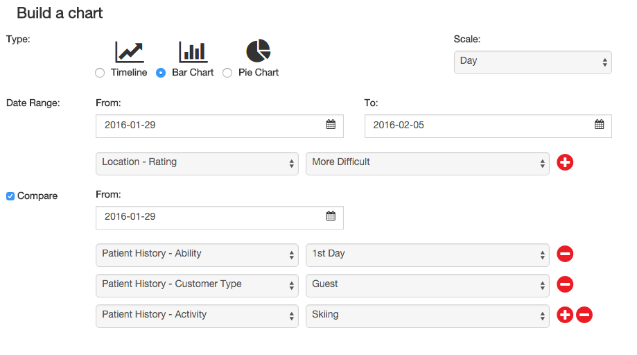
Comparing different data
Let’s say you want to find out the proportion of incidents are self admitted beginners find themselves out of their depth, and have an incident on an intermediate or advanced run.
We start by selecting a date range, and then Location – Rating to find all incidents on that type of location.
Using the comparison feature we select the same starts date (so we compare on the same timeframe) and select Ability, Customer Type, Activity with Beginner Guests who were skiing.
We can select these items by using the (+) to add more data points to cut down the information we are looking at.
This then gives us the result we are looking for. Again we can then adjust the scale and look at this by day of week, or week of year to find trends relating to school holidays, long weekends or something less obvious.
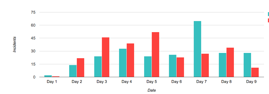
Bar chart of incidents on More difficult runs, compared to first time beginner skiiers.